We are storytellers and innovators - dedicated to finding and fostering exciting and diverse voices in entertainment and advertising, spotlighting fresh perspectives and developing new production practices.
Make sure you include a clear subject line, a CV and indicative rates if you’re getting in touch about freelance opportunities
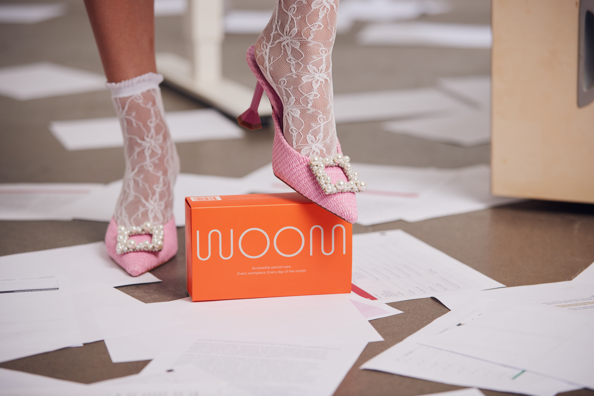
A monthly subscription box with pads and tampons delivered to your office. Made with 100% organic cotton, of course.
Half the world gets their period. But only a fraction of workplaces provide free and accessible period care. Confused? WOOM is too. That’s why we were brought on to build brand strategy, identity, packaging, voice and website.
When it came to choosing a palette for the brand, it felt destined that we ride the crimson wave. The vibrant, vermillion red hue could never hide what the product is really for: periods. Eye-catching and intoxicating, it’s impossible to not notice in any bland bathroom. When it came to type, we needed a sans serif font that was modern and friendly with a little personality. Neue Montreal was the one for us, which works well both in print and on screen.
Inspired by natural hormone fluctuations and the infradian rhythm during a menstrual cycle, we crafted WOOM’s logo to mirror this cyclical rise-and-fall in a simple wave form. When the W and M are connected, it forms an endless squiggle, further simulating the beauty of our ever-changing patterns.
Much like a bottle of Aesop hand wash, we wanted the WOOM packaging to present itself as a trendy, must-have item in every work bathroom. So, we designed the packaging with a sleek matte finish stamped with simple easy-to-read text to lend a sophisticated feel. Its sleeve provides businesses the option to leave it open or closed. And, as a progressive brand with an environmentally-conscious ethos, it was no question that our packaging be totally recyclable.
Elevated. Worldly. Well-read. The WOOM persona is a successful professional who keeps up with a bountiful LinkedIn network all the while maintaining an event-filled social calendar. They follow Italian interior design, boutique designer labels and their apartment smells like a mix of Le Labo and recently-burned Palo Santo. Because
Creative Direction & Design: Tessa Westerhoff
Producers: Andrew Macalpine & Erin Moy
Copy: Camille BuI Viet